
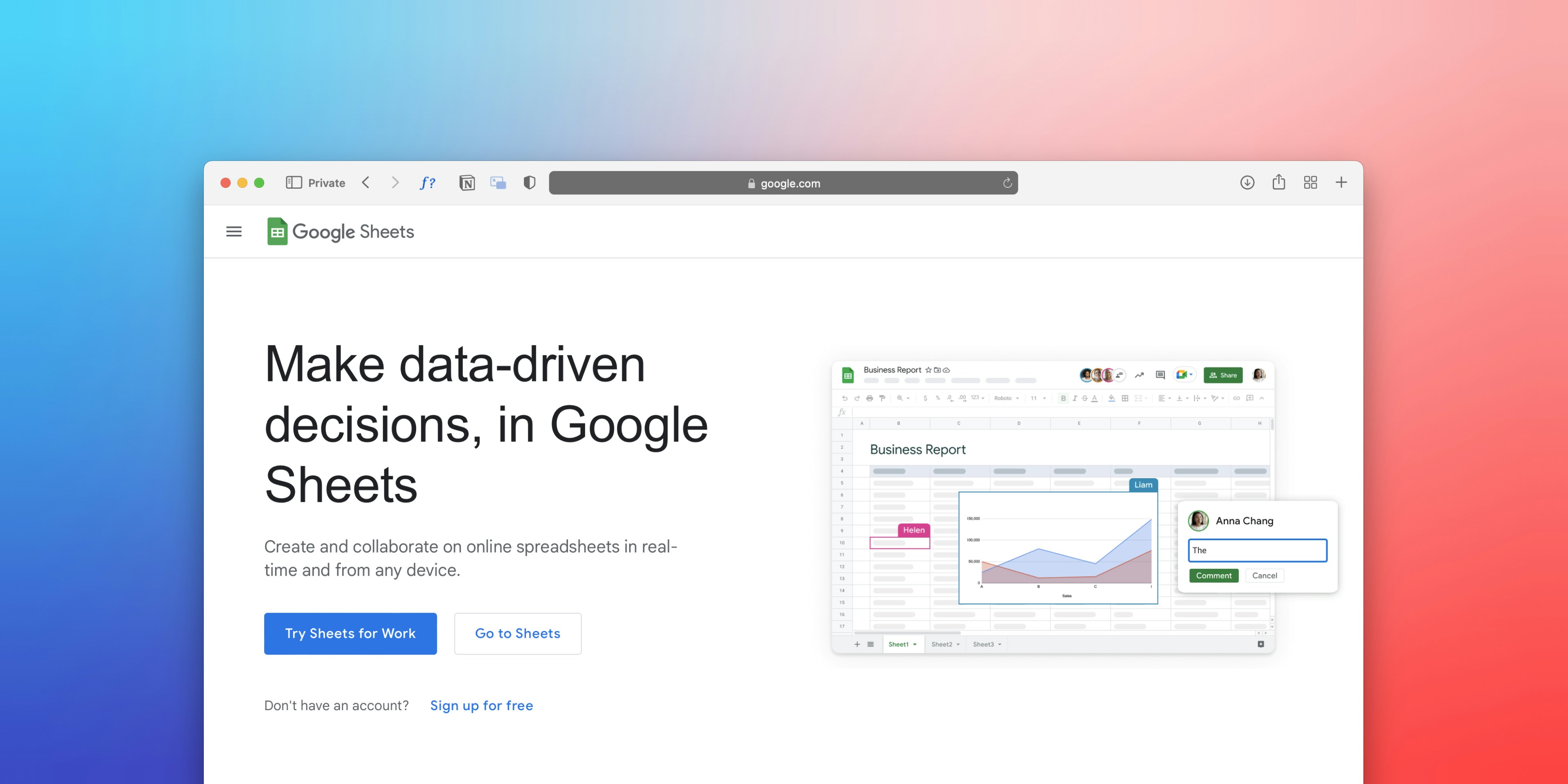
You're staring at rows of raw data in Google Sheets, knowing somewhere in those numbers lies the story of your business performance. Whether you're tracking sales metrics, monitoring project progress, or analyzing financial trends, turning spreadsheet data into a clear, visual KPI dashboard transforms how you make decisions. Even if you're exploring the best AI for financial modeling to enhance your analytics, mastering dashboard creation in Google Sheets remains a foundational skill that puts actionable insights at your fingertips. This guide will walk you through building a professional KPI dashboard in just 30 minutes, using charts, conditional formatting, and smart formulas to visualize what matters most.
While you can certainly build dashboards manually, a spreadsheet AI tool accelerates the entire process by understanding your data context and automatically generating dashboard components that would otherwise take hours to configure. Instead of wrestling with chart types or writing complex formulas from scratch, you can describe what you want to track and let the AI suggest layouts, create visualizations, and even identify which KPIs deserve prominence on your dashboard.
Table of Content
Why Teams Struggle to Create KPI Dashboards in Google Sheets
The Hidden Cost of Building KPI Dashboards Without a Clear Structure
The 30-Minute Workflow to Build KPI Dashboards Faster in Google Sheets
Summary
Teams waste 70% of their time fixing spreadsheet data rather than analyzing it, according to research from Quantum Veil Systems. The real bottleneck in dashboard creation isn't technical skill, it's the hours spent standardizing formats, removing duplicates, and tracing broken formulas across scattered tabs.
Dashboards fail when teams build before defining what success looks like. One person calculates the conversion rate as purchases divided by website visitors, while another uses purchases divided by email opens. Both formulas produce numbers, but they measure completely different things.
Mixing raw data, calculations, and visualizations on the same sheet turns maintenance into a nightmare. Users accidentally delete source data while adjusting charts, formulas break when someone sorts a column that other calculations reference, and updates require clicking through nested formulas to figure out which cell feeds which output.
The 30-minute dashboard constraint forces useful prioritization. You can't add every possible metric or experiment with five chart types, so you identify the three to five KPIs that actually drive decisions and ignore everything else. Speed comes from eliminating unnecessary complexity, not from shortcuts that break later.
Poor dashboard structure doesn't just slow decisions, it quietly biases them toward whatever metrics are easiest to access. When one KPI updates automatically, and another requires manual calculation, the automated one receives more attention, regardless of strategic importance. If revenue is clearly labeled but customer acquisition cost requires digging through nested formulas, people focus on revenue.
Spreadsheet AI tool handles the data preparation work that extends dashboard builds from 30 minutes to three hours, processing tasks like duplicate removal, format standardization, and bulk categorization through simple functions rather than manual column-by-column cleanup.
Why Teams Struggle to Create KPI Dashboards in Google Sheets
Teams don't struggle because Google Sheets lacks features. They struggle because they build dashboards before organizing their data, defining what success looks like, or deciding how information should flow. The result is a spreadsheet that looks like a dashboard but functions like a puzzle, where every update risks breaking something and every question requires digging through layers of tangled formulas.
The Data Cleanup Problem Happens First
Most teams pull data from multiple sources: CRM exports, ad platform reports, payment processors, and inventory systems. Each source formats dates differently, labels columns inconsistently, or includes blank rows that break formulas. Before you can visualize anything, you have to manually standardize formats, remove duplicates, and fill gaps.
According to DashboardDr, Google Sheets supports up to 10 million cells per spreadsheet, but that capacity means nothing when your data is scattered across tabs with inconsistent structures. The dashboard becomes harder to trust because the foundation beneath it shifts every time new data is added.
Metrics Get Defined Too Late
The common pattern is to build first, define later. Teams add charts before agreeing on what "conversion rate" means or whether revenue should include refunds. One person calculates customer lifetime value using total revenue divided by customer count. Another uses average order value multiplied by purchase frequency.
Both formulas live in the same dashboard, producing different numbers for the same metric. Users stop trusting the dashboard because they can't explain why two charts contradict each other, and fixing it requires rewriting formulas that now feed into other calculations.
Everything Lives in One Place
When raw data, calculations, and visualizations are on the same sheet, users accidentally overwrite the source data while trying to update a chart. A single deleted row breaks every formula referencing that range.
Tracing where a number comes from requires clicking through nested formulas across multiple tabs, and even experienced users struggle to follow the logic. The dashboard should display insights, not store the machinery that produces them. Mixing everything together turns a decision-making tool into a maintenance burden.
Design Overrides Clarity
Teams often prioritize visual polish over functional clarity. They add gradient fills, custom fonts, and multiple chart types to make the dashboard look professional. The result is visually impressive but cognitively exhausting. Users can't quickly distinguish which metrics are improving, which need attention, or what action to take.
A dashboard packed with ten different chart styles requires more interpretation time than a simple table with conditional formatting that highlights what matters. The goal isn't to impress, it's to inform.
No Shared Structure Across Teams
When different people build dashboards differently, every new report requires learning a new layout.
One dashboard puts KPIs at the top.
Another buries them in the middle.
Some use pivot tables,
Others use QUERY functions
A few rely on manual copy-paste updates
Collaboration slows because users spend more time figuring out how the dashboard works than interpreting what it shows. Consistency isn't about rigid templates; it's about reducing the cognitive load required to extract insight.
But messy dashboards don't just waste time; they quietly reshape how decisions get made.
Related Reading
The Hidden Cost of Building KPI Dashboards Without a Clear Structure

When you build a KPI dashboard without structure, you're not just creating a messy spreadsheet. You're building a decision-making tool that quietly erodes trust each time it's used. The dashboard might display numbers, but those numbers raise more questions than they answer, and eventually, teams stop relying on it altogether.
When Polished Dashboards Still Confuse
A dashboard can look professional and still fail at its core job. You add charts, color-coded cells, and summary tables because that's what dashboards are supposed to have. The visual layer feels complete, so you assume the dashboard works. But when someone asks, "Why did this metric drop?" or "Which KPI should we prioritize this week?" the dashboard doesn't provide clear answers.
It shows data without explaining what that data means or why it matters. The problem isn't missing information. It's missing hierarchy, missing context, and missing the structure that turns numbers into decisions.
The Real Cost Shows Up in Time, Not Errors
Quantum Veil Systems' research found that teams spend 70% of their time fixing data instead of analyzing it. That ratio reveals where poorly structured dashboards hurt most. Updating a dashboard shouldn't require tracing formulas across five tabs to figure out which cell broke.
Adding a new data source shouldn't mean rebuilding half your calculations because nothing was designed to scale. Every maintenance task stretches longer because the dashboard wasn't built with a clear separation between raw data, transformation logic, and final outputs. Time compounds, and what should take minutes starts consuming hours.
Structure Shapes What Gets Decided
When dashboards lack clarity, teams default to the metrics that are easiest to understand rather than the ones that matter most. If revenue is clearly labeled and customer acquisition cost requires digging through nested formulas, people focus on revenue. If one KPI updates automatically and another needs manual calculation, the automated one gets more attention. The dashboard doesn't just display information. It silently prioritizes which questions get asked and which insights get ignored. Poor structure doesn't just slow decisions. It biases them toward whatever is most accessible, regardless of strategic importance.
Spreadsheet AI tools like Numerous help teams add interpretive layers without having to rebuild their entire dashboard. Instead of manually categorizing performance trends or writing complex nested formulas to flag anomalies, you can use simple AI functions to summarize patterns, extract insights, and generate explanations directly in your existing sheet. This approach keeps your data structure intact while making the dashboard easier to interpret, especially when multiple stakeholders need to understand what the numbers mean without tracing every formula.
Inconsistency Becomes the Norm
When different people build dashboards differently, every report requires relearning how to read it. One person uses pivot tables, another uses QUERY functions, and someone else manually copies data each week. Metrics get calculated differently across teams because no one agreed on definitions upfront. "Monthly active users" means one thing in the marketing dashboard and something slightly different in the product dashboard.
Users stop trusting any single number because they've seen contradictory versions elsewhere. Consistency isn't about rigid templates. It's about reducing the mental effort required to extract meaning, so people spend their energy interpreting insights rather than decoding the dashboard itself.
Related Reading
How to Create KPI Dashboards in Google Sheets in 30 Minutes

You can build a functional KPI dashboard in 30 minutes if you focus on three things:
Clean data input
Clearly defined metrics
Simple, automatically updating visuals
The speed comes from eliminating unnecessary complexity, not from shortcuts that break later. Most teams spend hours building dashboards because they skip the structural decisions that make everything else faster.
The 30-minute window forces prioritization. You can't add every possible metric, experiment with five chart types, or build elaborate conditional formatting. That constraint is useful. It pushes you to identify the three to five KPIs that actually drive decisions and ignore everything else. When you know what matters before you open Google Sheets, the dashboard builds itself.
Start With Data That Doesn't Need Fixing
The first ten minutes determine whether the rest of the process flows or stalls. If your source data has inconsistent date formats, merged cells, or blank rows scattered throughout, you'll spend the entire 30 minutes cleaning instead of building.
The dashboard depends on data that follows predictable patterns:
One header row
Consistent column names
No gaps
No duplicates
Data Standardization and Structural Integrity
Pull data from a single source whenever possible. If you're combining CRM exports with ad platform reports, standardize formats before importing.
Use the same date format across all columns.
Remove any summary rows or totals that break formulas.
Make sure numeric columns contain only numbers, not text mixed with currency symbols.
This preparation feels tedious, but it's the difference between formulas that work immediately and formulas that throw errors you'll spend 20 minutes debugging.
Clean Data Prevents Dashboard Errors
Many teams underestimate how much time they lose to data inconsistency. They assume Google Sheets will handle messy inputs, then wonder why their charts display incorrectly, or their totals don't match. The spreadsheet does exactly what you tell it to do. If your data structure is unclear, your dashboard will reflect that confusion.
Define Metrics Before You Build Anything
Most dashboard failures occur because teams add charts before agreeing on what they're measuring. One person calculates the conversion rate as purchases divided by the number of website visitors. Another uses purchases divided by email opens. Both formulas produce numbers, but they measure different things. When those numbers appear side by side in the dashboard, users assume they're comparable. They're not.
KPI Definition and Metric Consistency
Write down your KPI definitions in plain language before creating any formulas.
If you're tracking revenue, specify whether that includes refunds, taxes, or pending transactions.
If you're measuring customer acquisition cost, clarify which expenses are included.
If you're calculating a growth rate, decide whether you're comparing month-over-month, year-over-year, or quarter-over-quarter.
These decisions take two minutes, but skipping them can lead to hours of rework later.
Use Consistent Metrics
The goal isn't to pick perfect metrics. It's to pick consistent ones. A dashboard that measures the wrong thing consistently is still more useful than one that measures five things five different ways. Users can course-correct if they understand what the numbers represent. They can't do anything with contradictory data.
Separate Data, Logic, and Display
The biggest structural mistake is mixing raw data, calculations, and visualizations on the same sheet. When everything lives together, users accidentally delete source data while trying to adjust a chart. Formulas break because someone sorted a column that other formulas reference. Updates require clicking through nested calculations to figure out which cell feeds which chart.
Modular Architecture and Structural Separation
Create three separate sheets or clearly defined sections.
The first holds raw data, untouched after import.
The second contains all calculations: formulas that transform raw data into the metrics you defined.
The third displays only the final dashboard:
Charts
Summary tables
Key numbers
This separation makes updates predictable. New data goes into the first sheet. Calculations update automatically every second. The dashboard refreshes without manual intervention.
This structure also makes collaboration safer. Multiple people can view the dashboard without risking accidental edits to source data. If something breaks, you know exactly where to look. Formulas live in one place, data in another, visuals in a third. Debugging takes minutes instead of hours because the logic is contained and traceable.
Use Simple Charts That Answer One Question Each
Complex visualizations slow comprehension. A stacked bar chart with six categories and three data series requires mental effort to interpret. A line chart showing a single metric over time immediately answers the question. The 30-minute constraint forces simplicity, which makes the dashboard more useful.
Choose the Right Chart Type
Choose chart types based on what you're comparing.
Line charts show trends over time.
Bar charts compare values across categories.
Pie charts show proportions of a whole, but only when you have three to five slices.
Anything more becomes unreadable. Avoid dual-axis charts unless the two metrics are directly related. Avoid 3D effects, gradient fills, or decorative elements that don't add information.
Make Each Chart Answer One Question
Each chart should answer a single question.
How is monthly revenue trending? gets a line chart.
Which product category generates the most revenue? gets a bar chart.
What percentage of revenue comes from repeat customers? gets a pie chart or a simple percentage callout.
When users look at the dashboard, they shouldn't need to study each chart to figure out what it's trying to say.
Highlight Key Numbers So They're Impossible to Miss
Users shouldn't search for the most important metrics. If total revenue, net profit, and customer count are the three numbers that matter most, put them at the top of the dashboard in large, bold text.
Use conditional formatting to color-code performance:
Green when a metric exceeds the target
Red when it falls short
Yellow when it's close
This approach works because it reduces cognitive load. Users glance at the dashboard and immediately know whether things are improving or declining. They can drill into charts for details, but the high-level status is clear within seconds. That clarity is what makes dashboards useful in practice, not just in theory.
AI Integration and Interpretive Context
Spreadsheet AI tools like Numerous help teams add interpretive context without manually writing complex formulas. Instead of building nested IF statements to categorize performance levels or writing QUERY functions to summarize trends, you can use simple AI functions to generate explanations, flag anomalies, or extract insights directly in your sheet. This keeps your dashboard structure clean while making the numbers easier to interpret for stakeholders who don't want to trace every formula.
Arrange the Layout So Information Flows Naturally
The dashboard should follow a visual hierarchy that matches how people process information. Key metrics go at the top because that's where eyes land first. Charts that show trends or comparisons go in the middle because they provide context for the top-line numbers. Detailed tables or breakdowns go at the bottom for users who need to dig deeper.
Visual Clarity and Layout Standardization
Avoid cluttering the layout with too many elements. White space isn't wasted space. It gives the eye room to focus on what matters. If your dashboard feels crowded, remove the least important chart rather than shrinking everything to fit. A dashboard that shows five metrics clearly is more useful than one that shows ten metrics poorly.
Consistency in layout also speeds comprehension. If you build multiple dashboards for different teams, use the same structure:
KPIs at the top
Trends in the middle
Details at the bottom
Users spend less time figuring out where to look and more time interpreting what they see.
Link Charts Correctly So Updates Happen Automatically
Hard-coded values kill dashboard efficiency.
If you manually type numbers into cells that feed charts, every update requires finding and replacing those values.
If you use static ranges in formulas, adding new rows of data means rewriting formulas to include the expanded range.
Use dynamic ranges whenever possible. Instead of referencing A2:A50, use A2:A or define a named range that adjusts automatically as data grows. Link charts to your calculation sheet, not to raw data. This way, if you need to change how a metric is calculated, you update one formula and every chart refreshes. The dashboard stays accurate without manual intervention.
Update Validation and Integrity Testing
Test the update process before considering the dashboard complete. Add a new row of data to your source sheet and confirm that all calculations and charts update correctly. If something doesn't refresh, trace the formula to find where the link broke. Fixing these issues during the build process takes minutes. Discovering them weeks later, when someone relies on outdated numbers, creates real problems.
Keep Inputs Separate From Outputs
Some dashboards require user input:
Date ranges
Product filters
Target values
These inputs should live in clearly labeled cells, separate from calculations and visuals. When users need to change a parameter, they know exactly where to go. When they want to reset to defaults, they can do so without accidentally overwriting formulas.
Auditability and Structural Logic
This separation also makes the dashboard easier to audit. If a number looks wrong, you can check the inputs first, then verify the calculations. You're not hunting through a tangled sheet trying to figure out which cell controls which output.
Everything has a clear role:
Inputs define parameters
Calculation processes data
Outputs display results
The 30-minute build only works if you make these structural decisions upfront. Skip them, and you'll spend the time troubleshooting instead of building.
The 30-Minute Workflow to Build KPI Dashboards Faster in Google Sheets

You build a KPI dashboard in 30 minutes by treating it as a sequence of discrete decisions rather than a creative project. The workflow works because it eliminates the back-and-forth that consumes most dashboard builds:
Deciding what to measure while designing layouts
Fixing data while building charts
Clarifying definitions after formulas already exist
When you separate preparation from execution and execution from polish, each step completes faster because nothing depends on unfinished work.
Minutes 0 to 5: Prepare Data So Formulas Don't Break Later
The first five minutes determine whether the rest of the build flows or stalls. Import your source data into a dedicated sheet and scan for the structural issues that break formulas:
Merged cells
Inconsistent date formats
Blank rows between data
Text mixed into numeric columns
Fix these now, not when a chart displays incorrectly 20 minutes later, and you're tracing errors backward through nested formulas.
Standardize Your Data Structure
Standardize column headers to be short, descriptive, and free of special characters. "Revenue ($)" becomes "Revenue". "Customer Name (Primary Contact)" becomes "Customer". Google Sheets interprets headers literally in formulas, and extra punctuation or spaces create reference errors that waste troubleshooting time. Remove any summary rows or subtotals embedded in your data. They're useful in reports but destructive in dashboards because formulas treat them as data points, skewing totals and averages.
Test your data structure by writing a simple SUM formula. If it returns the correct total without adjustments, your data is clean. If it throws an error or produces an unexpected result, you've found a structural issue that needs to be fixed before you proceed.
Minutes 5 to 10: Define KPIs With Precision, Not Ambiguity
Write down the three to five metrics that drive decisions in your business. Not the metrics you think you should track, the ones you actually use when evaluating performance. If you're measuring revenue, specify whether that includes pending transactions, refunds, or taxes.
If you're tracking customer acquisition cost, clarify which expenses count:
Ad spend only
Ad spend plus salaries
Tools
Overhead
Standardized Definitions and Data Trust
These definitions prevent the problem where two people calculate the same metric differently and produce contradictory numbers. One person measures conversion rate as purchases divided by total visitors. Another uses purchases divided by email clicks. Both formulas work, but they measure different things. When both appear in the same dashboard without clear labels, users assume they're comparable. They're not, and the confusion undermines trust in every number the dashboard displays.
Document your definitions in a separate sheet or a comment block at the top of your calculations tab. When someone questions a number six months later, you'll know exactly how it was calculated and why. This step takes two minutes but saves hours of reconstruction work when stakeholders challenge your data.
Minutes 10 to 18: Build Calculations in a Separate Sheet
Create a dedicated "Calculations" sheet where all formulas live. This sheet references your raw data but does not modify it. Each KPI gets its own clearly labeled cell or range.
Total Revenue goes in B2
Total Expenses in B3
Net Profit in B4
Use cell references, not hard-coded values, so updates propagate automatically when new data arrives.
Write formulas that remain stable when data grows. Instead of SUM(A2:A50), use SUM(A2:A) or define a named range that expands automatically. This prevents the common failure mode where adding new rows breaks your dashboard because formulas still reference the old, smaller range. Test this by adding a dummy row to your source data and confirming that all calculations update correctly.
Formula Simplicity and Maintenance Logic
Keep formulas simple enough that someone else can understand them without documentation. Nested IF statements with five conditions might work today, but they become unmaintainable when you need to modify logic three months later. If a formula requires more than two levels of nesting, break it into intermediate steps across multiple cells. This makes logic traceable and errors easier to debug.
Power users keep to themselves, but the difference between someone who uses spreadsheets and someone who uses them well often comes down to knowing how to structure calculations so they don't require constant maintenance. The formula that works once isn't useful. The formula that works every time you add new data is.
Minutes 18 to 23: Create Charts That Answer One Question Each
Choose chart types based on what you're comparing, not what looks impressive.
Line charts show trends over time, so use them for metrics like monthly revenue or weekly active users.
Bar charts compare values across categories, so use them for revenue by product or expenses by department.
Pie charts show proportions, but only when you have three to five slices. More than that becomes unreadable.
Chart Decoupling and Interpretive Clarity
Link each chart to your Calculations sheet, not to raw data. This separation means you can change how a metric is calculated without having to rebuild charts. If you decide to exclude refunds from revenue, you update one formula, and every chart refreshes automatically. If charts link directly to raw data, that same change requires manually editing every chart's data range.
Avoid dual-axis charts unless the two metrics have a direct, meaningful relationship. Plotting revenue and website traffic on the same chart might seem useful, but it implies a correlation that may not exist. Users will assume the lines should move together, and when they don't, the chart raises more questions than it answers. One metric per chart keeps interpretation clear.
Minutes 23 to 27: Arrange the Layout So Eyes Land on What Matters
Put your most important numbers at the top of the dashboard in large, bold text. If total revenue, net profit, and customer count are the metrics that drive decisions, they should be the first thing users see.
Use conditional formatting to color-code performance:
Green when a metric exceeds the target
Red when it falls short
This visual hierarchy means users know the overall status within seconds, before they even look at charts.
Hierarchical Layout and Visual Prioritization
Place trend charts in the middle section because they provide context for the top-line numbers. If revenue is down 15%, the trend chart shows whether that's a sudden drop or part of a longer decline. Position detailed breakdowns or supporting tables at the bottom for users who need to investigate specific issues. Most people won't scroll that far, and that's fine. The dashboard should answer the most common questions first, then provide depth for those who need it.
White space isn't wasted space. It gives the eye room to focus on what matters. If your dashboard feels crowded, remove the least important chart rather than shrinking everything to fit. A dashboard that shows five metrics clearly beats one that shows ten metrics poorly.
Minutes 27 to 30: Test Updates and Confirm Automation Works
Add a new row of data to your source sheet and verify that all calculations and charts refresh correctly. If something doesn't update, trace the formula to find where the link broke. This is the moment to catch static references, hard-coded values, or formulas that don't expand as new data arrives. Fixing these issues now takes minutes. Discovering them later, when someone relies on outdated numbers, creates real problems.
Dynamic Formatting and Decision Utility
Check that your conditional formatting rules still apply to the correct ranges. If you set up a rule to highlight cells in B2:B10 and your data now extends to B15, the new rows won't be formatted. Adjust ranges to be dynamic or extend them manually so future data gets the same visual treatment.
Confirm that your dashboard answers the questions it's supposed to answer.
If someone asks, "How is revenue trending?" can they find the answer in five seconds?
If they ask, "Which product category is underperforming?" Does the dashboard make that obvious?
If the answer to either question is no, you've built a data display, not a decision-making tool.
Why This Sequence Prevents the Common Failure Modes
Most dashboard builds fail because teams combine preparation, execution, and polish into a single chaotic process. They clean data while building charts, define metrics while writing formulas, and adjust layouts while still figuring out what to measure. Each decision depends on unfinished work, so nothing completes cleanly. The 30-minute workflow works because it completely separates these phases.
Sequential Workflow and Rework Elimination
You prepare data before building anything, so formulas don't break mid-build.
You define KPIs before writing calculations, so metrics stay consistent.
You build calculations before creating charts, so visuals update automatically when logic changes.
You arrange the layout after the charts exist, so you're organizing finished components rather than placeholder ideas.
Each step completes before the next begins, and that linear progression eliminates most of the rework that can stretch dashboard projects from 30 minutes to three hours.
Forced Prioritization and Data Clarity
The constraint also forces prioritization. You can't add every possible metric, experiment with five chart types, or build elaborate conditional formatting. You pick the three to five KPIs that actually drive decisions and ignore everything else. That limitation isn't a compromise. It's what makes the dashboard useful. Teams don't struggle because they lack data. They struggle because they're drowning in it, and dashboards that try to show everything end up clarifying nothing.
The Real Bottleneck Isn't Technical, It's Interpretive
Building the dashboard is the easy part. The hard part is making sure it answers questions people actually ask. A dashboard can display revenue, expenses, and profit perfectly yet still fail to show which product is driving growth or which region is underperforming. The numbers are accurate, but they don't connect to decisions.
Insight Gaps and Decision-Driven Design
This gap shows up when stakeholders look at the dashboard and immediately start asking follow-up questions that require digging into raw data. If that happens consistently, the dashboard isn't surfacing the right insights. It's showing what's easy to calculate instead of what's useful to know. The solution isn't adding more charts. It's rethinking which questions the dashboard needs to answer and restructuring metrics to address those questions directly.
Teams often underestimate how much manual interpretation still happens after a dashboard is built. They calculate growth rates but don't flag which ones are accelerating versus decelerating. They show revenue by category but don't highlight which categories are trending up or down. Users end up doing the analysis themselves, and the dashboard becomes a data source instead of a decision-making tool.
AI Augmentation and Interpretive Efficiency
Spreadsheet AI tools like Numerous help close this gap by adding interpretive layers without complex formulas. Instead of writing nested IF statements to categorize performance or manually flagging anomalies, you can use simple AI functions to summarize trends, extract key insights, or generate explanations directly in your sheet.
This keeps your dashboard structure intact while making the numbers easier to interpret for stakeholders who don't want to trace every formula. The AI processes data at scale, so tasks that would require multiple helper columns and lookup tables are reduced to a single function call.
When the 30-Minute Build Doesn't Work
This workflow assumes your data is already accessible and reasonably clean. If you're pulling from multiple systems with incompatible formats, or if your source data requires extensive transformation before it's usable, 30 minutes won't be enough. The preparation phase alone could take an hour or more, and rushing through it just creates a dashboard built on unstable foundations.
The workflow also assumes you've already agreed on which KPIs matter. If you're still debating whether to track gross revenue or net revenue, or whether customer acquisition cost should include overhead, those conversations need to happen before you start building. Trying to resolve definitional questions while constructing formulas inevitably leads to rework.
Real-Time Integration and Workflow Scope
If your dashboard needs to update in real time or pull live data from external sources, the workflow changes. You'll need to set up data connections, configure refresh schedules, and test synchronization. That adds complexity and time that the 30-minute framework doesn't account for. This workflow works for dashboards that update periodically rather than continuously.
The Structure You Build Today Determines How Fast You Move Tomorrow
The real value of this workflow isn't the 30 minutes you save on the first build. It's the hours you save on every subsequent update. When data, calculations, and visuals live in separate, clearly defined spaces, adding new metrics or adjusting formulas takes minutes instead of requiring a full rebuild. When KPIs have documented definitions, new team members can understand the dashboard without needing a walkthrough.
Consistency across dashboards compounds these benefits. If every dashboard in your organization follows the same structure, users spend less time figuring out where to look and more time interpreting what they see. Onboarding becomes faster because people learn one system instead of relearning layouts with every new report. Collaboration improves because everyone speaks the same language when discussing metrics.
Standardized Methodology and Systemic Execution
The teams that build dashboards fastest aren't the ones with the most advanced Excel skills. They're the ones who've standardized their approach so thoroughly that most decisions are already made before they open a spreadsheet. They know which KPIs matter, how to structure data, where calculations belong, and what chart types answer which questions. The 30-minute build is just the execution of a system they've already internalized.
But even perfectly structured dashboards still fail if they can't adapt when someone asks a question you didn't anticipate.
Build KPI Dashboards Faster With Numerous
The dashboard takes too long because you're doing work that doesn't need to be manual. Cleaning inconsistent data, standardizing metric definitions, and organizing KPI inputs across tabs are tasks that happen before you even start building charts. The spreadsheet waits while you prepare everything by hand.
Use Numerous Inside Your Spreadsheet
Open Numerous directly in Google Sheets and prompt it to clean your data, standardize formats, and structure KPI inputs faster than manual work allows. Instead of writing formulas to categorize performance levels or building helper columns to flag anomalies, use simple AI functions to process data at scale. The tool handles repetitive setup work without requiring you to leave your spreadsheet or learn new platforms.
Turn Raw Data Into Dashboard-Ready Structure
Prompt Numerous to remove duplicates, standardize date formats, or fill missing values across thousands of rows in seconds. Ask it to categorize transactions, extract key metrics, or generate performance summaries that would otherwise require nested formulas and multiple pivot tables. The AI processes bulk tasks that consume hours when done manually, turning messy source data into clean, organized inputs your dashboard can reference immediately.
No More Slow Cleanup Cycles
Teams using spreadsheet AI tools like Numerous reduce data preparation time from hours to minutes by letting the AI handle pattern recognition, categorization, and standardization tasks that don't require human judgment. You define what clean data looks like once, then reuse that prompt every time new data arrives. The workflow becomes repeatable, and updates that used to require manual intervention now happen through a simple function call.
Faster Setup, Cleaner Results
You'll have standardized KPI definitions, organized input ranges, and formatted data ready for charting without the manual column-by-column cleanup that stretches dashboard builds from 30 minutes to three hours. The structure stays consistent because the AI applies the same logic every time, eliminating the inconsistencies that appear when different people prepare data differently.
Open Numerous, use it inside your spreadsheet, and turn dashboard preparation from a manual bottleneck into an automated step. Google Sheets builds the visuals. Numerous handles the work that makes those visuals possible.
Related Reading
How To Calculate Total Revenue In Excel
How To Make A Financial Report In Excel
How To Categorize Expenses In Excel
Cube Alternative
Best Excel Functions For Finance
How To Create An Expense Tracker In Excel